Packaging and Logo Design - Corn Pops Cereal
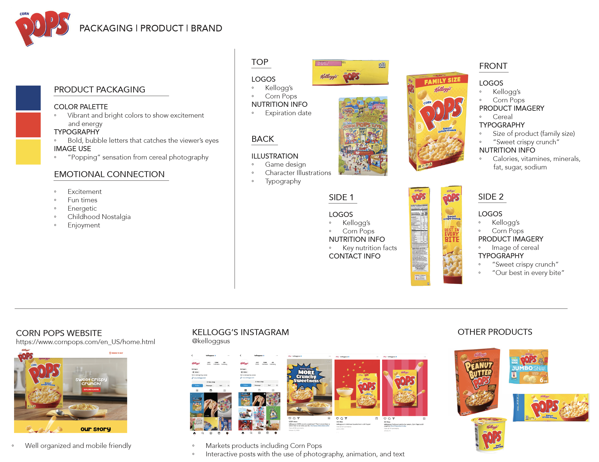
This conceptual redesign of Corn Pops Cereal focuses on refreshing the visual identity and packaging to enhance shelf appeal and create a more engaging experience for consumers. The goal was to design packaging that would attract attention, tell a story, and offer value throughout the entire user journey — from store shelf to breakfast table. To guide the design direction, I began by exploring the competitive landscape of cereal packaging. I studied Corn Pops and its main competitors to evaluate marketing approaches, brand personalities, and packaging structure. I also considered how cereal boxes are placed in stores, the materials used, and what types of visual information are most important to consumers. This research helped define the tone of the redesign and informed decisions about layout, color, content hierarchy, and interactivity.


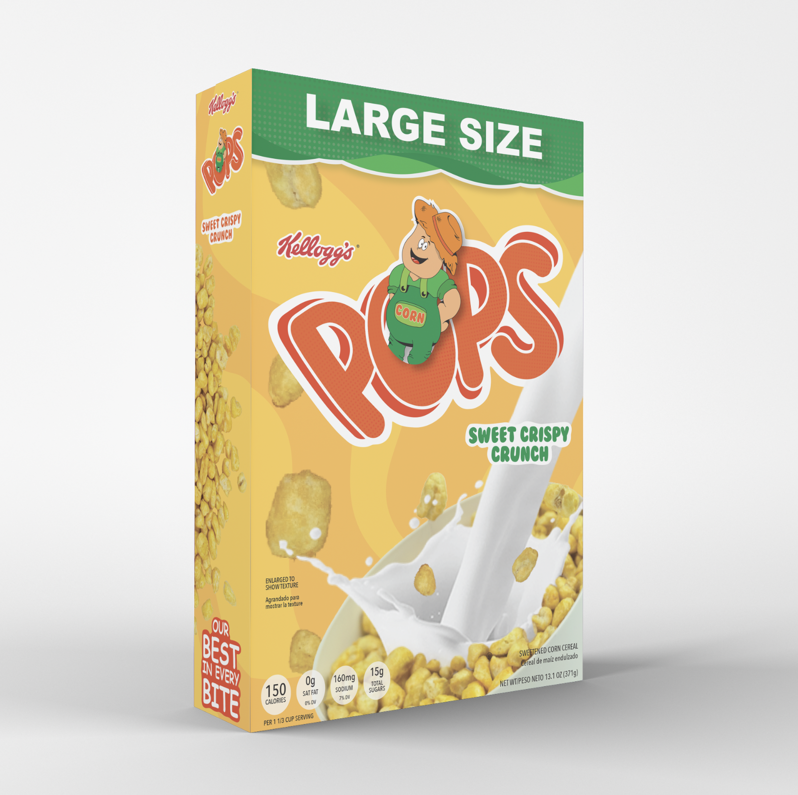
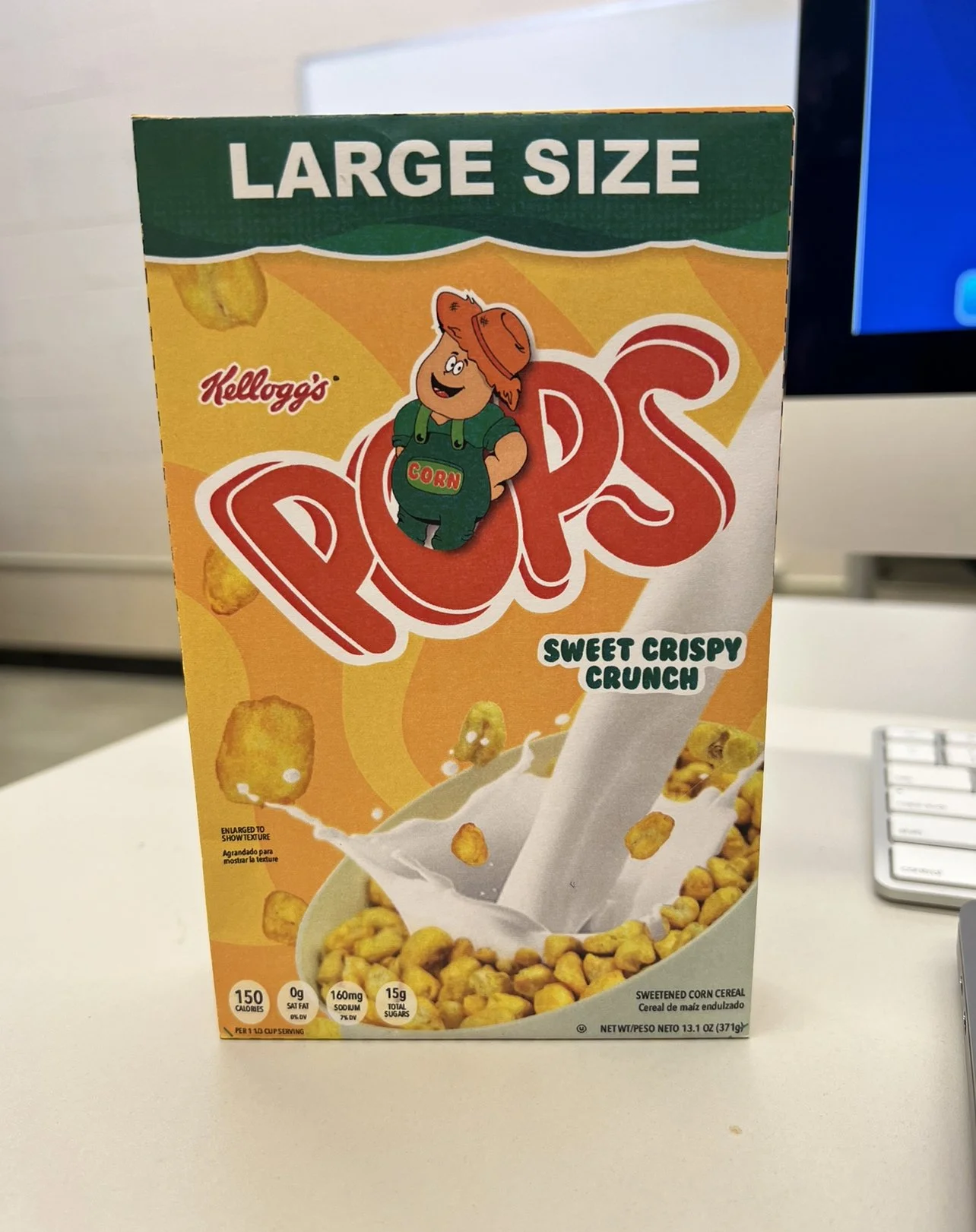
I began the design process by developing a new logo centered around a character mascot. The mascot is a friendly farmer wearing a straw hat, designed to evoke a sense of warmth, nostalgia, and a homestead feel that aligns with the wholesome, corn-based product. His expression and body language are intentionally welcoming to appeal to both kids and parents. The word “corn” is subtly woven into the fabric of his overalls, creating a visual connection between the character and the product without being overly literal. This detail adds personality and reinforces brand recognition through storytelling.
For the text portion of the logo, I selected a playful, rounded typeface to give the brand an energetic and approachable feel. Bright, saturated colors were used to attract attention, especially on a crowded cereal shelf. I applied a gradient and a subtle textured pattern inside the letterforms to create depth and visual interest. A darker outline was added to enhance contrast and improve legibility at various sizes. Together, the mascot and typography create a bold and engaging logo that anchors the entire packaging design and sets the tone for the rest of the brand.
Corn Pops Logo Design


I created a dieline based on the existing measurements of the original Corn Pops cereal box, including all technical elements such as bleed, cut, safety, and score lines. This guided the structural layout of the design and helped ensure everything would print and fold correctly. I paid close attention to the positioning and spacing of each design element and included all required product details, such as the nutrition label, allergen warnings, and certification icons.
On the back of the box, I designed an interactive coloring section where kids can bring “Pop’s Farm” to life using collectible stickers. A continuous background design wraps around the packaging to create a sense of fluidity and cohesion across all sides. A warm, inviting color scheme was used to reflect the friendly and nostalgic feel of the brand.
Dieline

To create custom imagery for the front and side panels, I photographed the cereal in a variety of positions and angles. These images helped bring a more dynamic and realistic quality to the visuals and allowed for a consistent photographic style throughout the packaging.
Imagery and Photography

I created several mockups to bring the design to life and ensure the dieline was accurate. These mockups were used to test how the design translated from screen to print and how the packaging looked in a real-world setting. I photographed both flat and assembled versions to highlight structure, usability, and final appearance.
Mockups

The final packaging showcases the complete redesign of Corn Pops as a playful, family-friendly brand with an interactive and story-driven feel. The cohesive use of color, character illustration, custom photography, and layout creates a visually rich and memorable experience. The box functions not only as a container but also as an extension of the brand's identity — encouraging interaction, imagination, and shelf appeal.
Final Packaging