
Visual Identity - Patches Veterinary and Emergency Services
Patches Veterinary and Emergency Services is a conceptual branding project focused on developing a complete visual identity for a veterinary clinic offering both routine and emergency care. The brand was designed to feel trustworthy, welcoming, and emotionally engaging for pet owners navigating everyday appointments or urgent situations.

Research and Content
The process began with visual research and moodboarding to explore tone, audience expectations, and stylistic possibilities within the veterinary and medical care space. I created a stylescape to define the brand’s personality by focusing on a balance of playfulness and professionalism through thoughtful color, typography, and imagery choices.
Logo Design
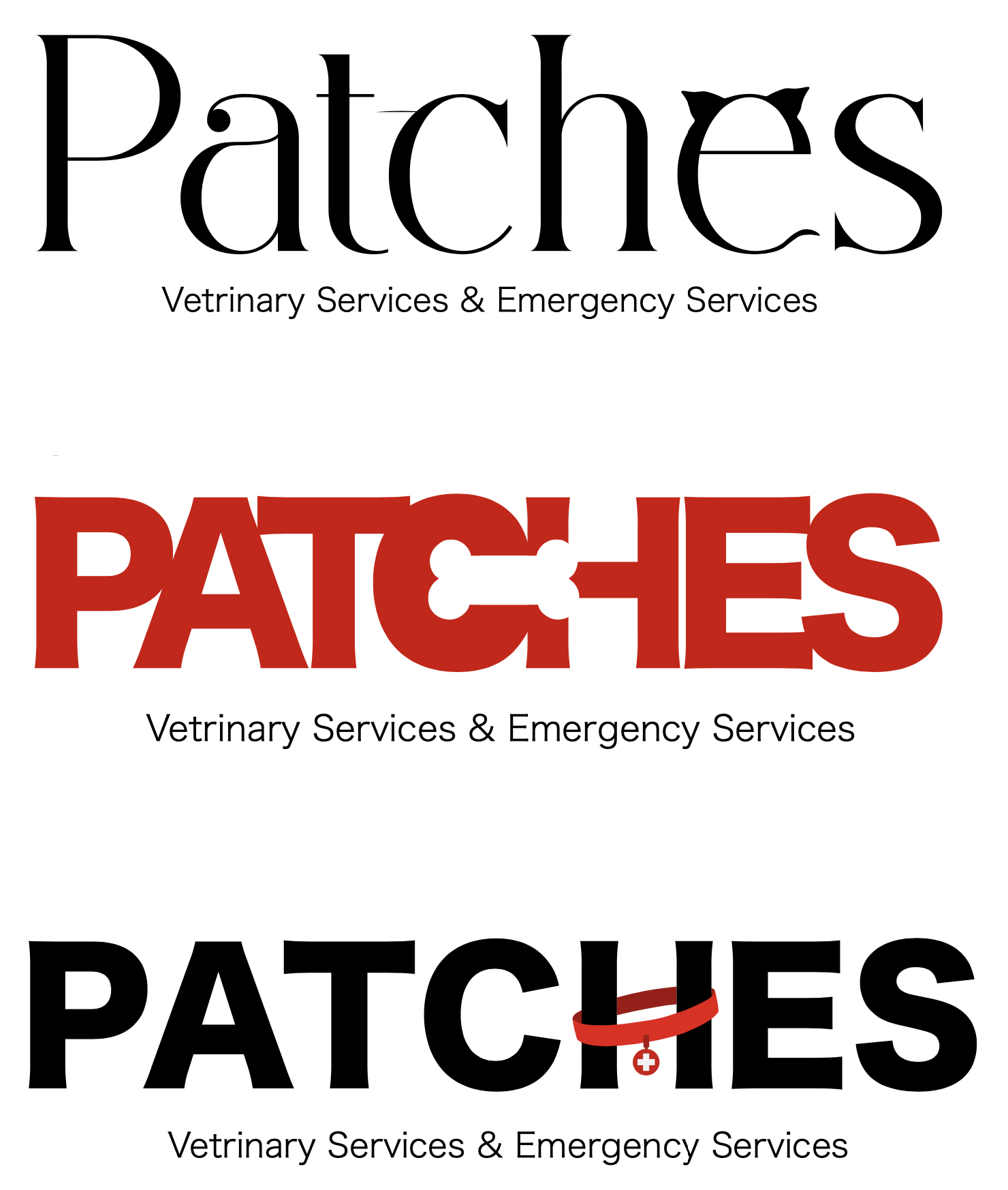
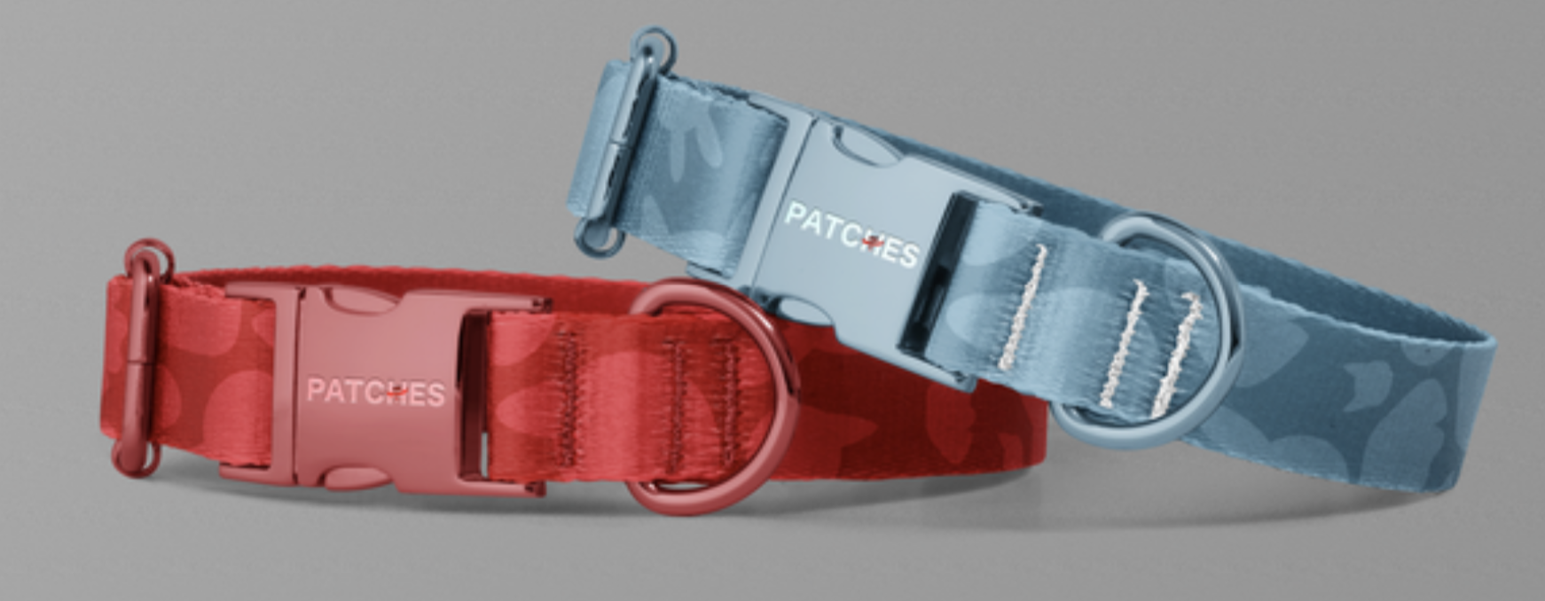
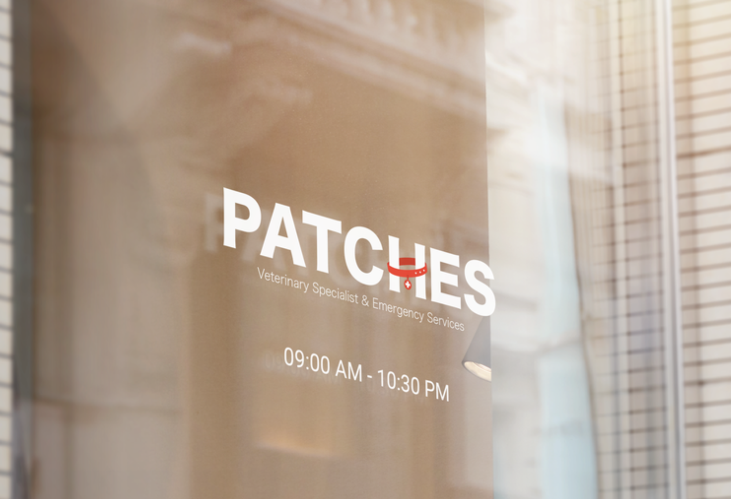
I wanted the logo to feel approachable and playful, while still maintaining clarity and professionalism. I combined custom typography with illustration to create a visual mark that reflects the warm, caring nature of the clinic. It was important that the logo could adapt across a variety of materials without losing its character. I considered how it would appear on items such as pill bottles, envelopes, signage, and uniforms to ensure it remained consistent and effective at different sizes.


Bringing the Brand to Life
With the logo and core identity elements in place, it was time to bring the brand to life through supporting visuals. I created a set of illustrations and patterns that reinforce the playful and approachable tone of the brand. These elements were designed to complement the logo and add personality across various touchpoints. They can be used in applications such as branded apparel, packaging, social media, and in-clinic signage to create a more immersive and memorable experience.


Red was chosen as the initial primary color to represent urgency and draw attention, reflecting the clinic’s emergency care services. I later added blue as a primary color to introduce a sense of calmness and trust, helping to create a more balanced and approachable overall tone for the brand.


Brand Application
To demonstrate how the brand identity functions in a digital environment, I designed a responsive website prototype using Adobe XD. The site layout showcases how the brand’s colors, typography, and visual language work together in an interactive setting. This part of the process focused on maintaining a consistent tone while also considering user experience, accessibility, and hierarchy. The website design helps illustrate how the brand can adapt to digital platforms while still feeling cohesive and engaging.